Bitcoin Reserve
We have developed a comprehensive branding for the Bitcoin Reserve, company that enables people from all over the world to get acquainted with crypto technologies in general and Bitcoin and understand how you can increase your capital and become richer with the help of Bitcoin.

Goal of Project
We start by introducing the user to Bitcoin and the crypto ecosystem in general, showing them how to grow their capital through long-term investments in Bitcoin and crypto assets. The project's ultimate goal is to evolve into a large marketplace featuring a comprehensive knowledge base in the crypto space and AI.
For this, we crafted a bold and future-focused visual identity that bridges traditional finance and the digital frontier. From the logo to the website, from UI cards to the typographic system — every element is designed to educate, empower, and guide the user. The interface is intuitive and accessible, with clear pathways to learning, investment, and growth.
Bitcoin Reserve is now a trusted space for crypto education, ready to expand into a full marketplace for crypto and AI knowledge.
The Bitcoin Reserve logo is built on a foundation of trust and recognizability. We refined the classic Bitcoin mark into a bold, modern icon with sharp edges and balanced geometry. It works equally well in small digital applications and large-scale branding, delivering strong brand recall.
The symbol unites tradition and forward momentum — it's not just a mark, but a signal of clarity in the ever-evolving crypto and capital growth through investment in Bitcoin.
To make sure the logo looks sharp everywhere — on screen, in the app, or on the exchange — we built it on a tight grid. Every shape is measured, balanced, and locked in. It’s not just clean geometry — it’s the foundation of recognition and brand power.
Color system built for trust
We crafted a bold yet professional palette — rooted in deep blues, lit with digital gradients, and charged with signal tones like orange and green. Each color plays its role: blue builds credibility, orange sparks action, green balances the system. This isn’t just a color set — it’s a UI-ready identity that works across dark mode, print, gradients, and real-world impact. Swipe through the full spectrum.


We chose Montserrat for its clarity, precision, and timeless digital feel. It’s geometric, neutral, and born for the screen — making it the perfect voice for Bitcoin Reserve. From dashboards to deep reads, its consistent rhythm keeps the brand confident and accessible at every size. Clean. Solid. UI-ready.


Numbers, headlines, and facts — all structured through a bold typographic hierarchy. Every size and weight was chosen to guide attention, create contrast, and make complex data feel simple. This system isn’t just aesthetic — it’s about clarity, scale, and making every insight hit harder.

Functional patterns built for clarity
Every element here carries meaning. From arrows to icons and infographics — these aren’t just visuals, they’re tools. Designed to reinforce clarity, structure, and a sense of precision, the Bitcoin Reserve pattern system scales effortlessly across interfaces, presentations, and educational content while staying unmistakably on brand.

These UI cards aren’t just layout tools — they carry the tone of Bitcoin Reserve. Strong shapes, contrast, and confident typography create a system that feels both premium and intuitive. Whether it’s a course, product, or announcement — each frame delivers information with clarity and purpose, while staying visually sharp across dark and light modes.

Deep 3D forms set the tone for the entire identity. They carry motion, direction, and focus. No chaos — just controlled dynamics that enhance recognition and build atmosphere.

A Feed Built Like a System
The Bitcoin Reserve Instagram isn’t just a collection of posts — it’s a structured extension of the brand’s UI. Every square post follows the visual logic: strict grid, precise type, signature colors. This is more than content — it’s interface, turned into a feed.
Before we talk products, we show purpose. These posts are crafted to communicate Bitcoin Reserve’s mission, values, and positioning — not through loud claims, but through visual consistency and strategic clarity.
This is the brand’s core — credibility, trust, and long-game energy.
Whether it’s a logo reveal, 3D brand elements, or key messaging, each tile reinforces the story: Bitcoin Reserve is where education, technology, and identity align.

We back vision with verified numbers. These posts showcase key metrics, AI growth forecasts, product usage stats, and industry insights. From staking trends to education in AI — it’s not just information, it’s credibility in every scroll.
With clean layouts and bold numbers, Bitcoin Reserve makes complexity feel simple and data-driven storytelling — compelling.

From crypto news to AI breakthroughs — Bitcoin Reserve delivers timely content that keeps your audience informed. These posts mix live market insights, trend analysis, and expert takes to build authority and trust.
We translate complex updates into digestible, scroll-stopping visuals that feed the algorithm and the curious mind.

This content zone unlocks the brain of Bitcoin Reserve — where blockchain meets machine learning, and real-world utility becomes part of your daily scroll.
From GPT-4 breakthroughs to macro market shifts, we deliver bite-sized insights and smart visuals that position the brand at the intersection of education, finance, and emerging tech.
Clear value, bold voice, future-forward tone.

From robotic thinking to real-world tools — Bitcoin Reserve keeps shipping. We spotlight AI-driven features, powerful UI upgrades, and next-gen crypto learning systems that push the brand forward.
These posts showcase evolution in action — from interface refreshes to product launches, built to scale impact and deepen user engagement.

Stories that hit fast
Bold design, clear message, full brand vibe — made to stand out in one scroll.

Each step is clean, structured, and visually tight — built for scroll-stopping education and engagement.

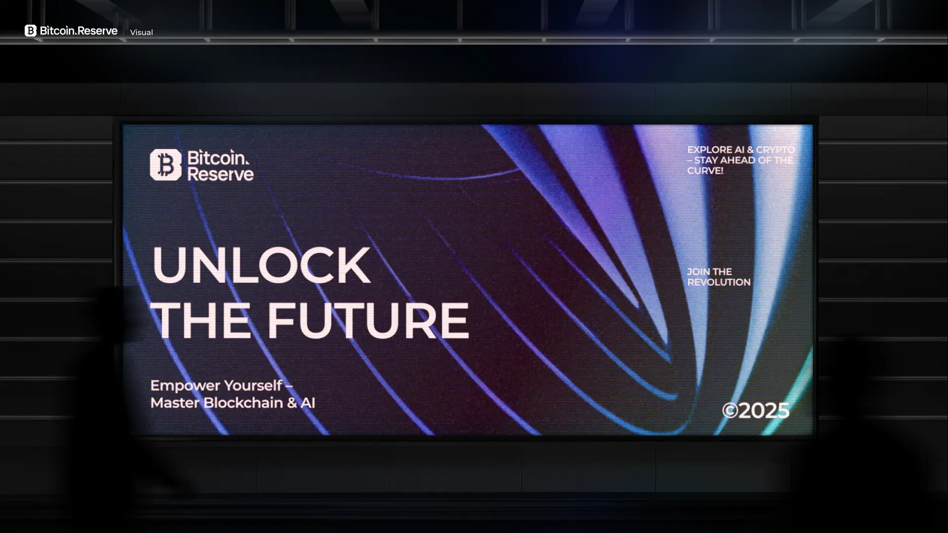
Real-world touchpoints, digital impact.
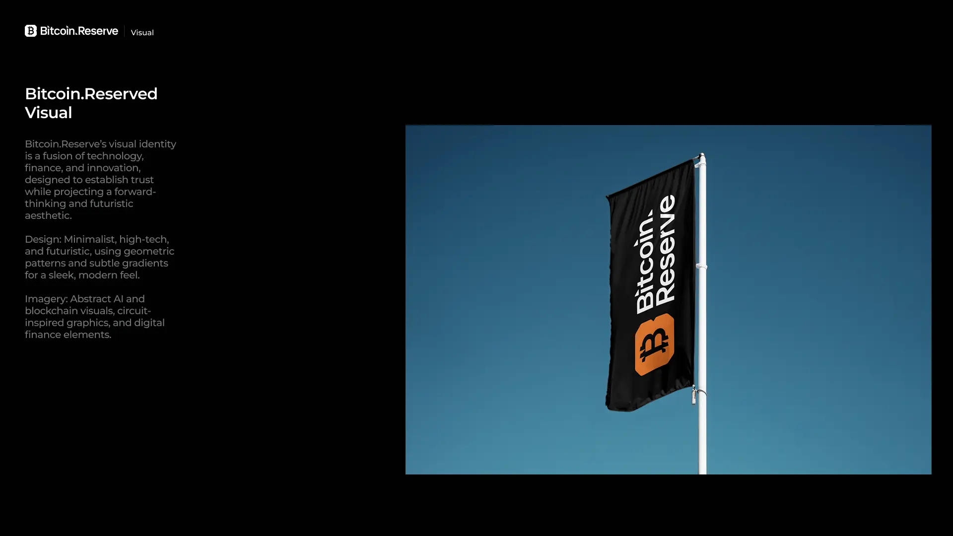
We brought the Bitcoin Reserve identity to life across a wide range of physical and digital assets — from branded apparel and event screens to mobile icons and app visuals. Every element reinforces brand recognition and trust, bridging online and offline presence with clarity, precision, and consistency.


Bitcoin Reserve isn’t just a brand — it’s a movement.
We shaped a system where design amplifies meaning, strategy meets clarity, and every touchpoint sparks trust. From identity to interface, merch to motion — everything works together to build a brand that educates, empowers, and endures in the digital era.
