Omega Brand
A brand born at the intersection of streetwear, crypto culture, and digital rebellion. We developed a comprehensive branding, website with non standart adaptation, and communication style that reflect power, defiance, and symbolic depth. Rooted in Greek motifs and metaphysical concepts, the brand features an antagonist mascot and the New Meta sublabel. The project unites e-commerce, aesthetic, and brand philosophy — all crafted to speak the language of a new generation.

OMEGA is a brand that weaves together future, technology, and myth into a cohesive visual system.
A project where every form carries meaning, and every symbol holds weight.
Our goal was to create an identity that operates on multiple levels — from the symbolic to the functional.

At the core of the symbol is a transformation of the Greek "Ω", turning it into a sign associated with resonance, closure, and strength.
We worked on a geometry that would be not only recognizable but also legible at any scale — from an icon to a digital environment.

The logo typography was also developed from scratch: it combines the mechanics of modular typefaces with the fluidity of digital motion, resulting in a distinctive and futuristic form.

Omega’s color system is built on strong contrast and energy.
At its core are Snow White and Print Black as key background tones that ensure maximum legibility. The accent color, Royal Purple, adds recognition and visual tension, functioning as a signal both in UI and in print. Light Gray serves as a neutral balancing tone.
The slider showcases examples of logo usage on dark and light backgrounds, as well as color pairings that preserve brand contrast and recognition across any environment.
The entire system was created as part of a cohesive digital branding approach, maintaining consistency between print and screen.


The primary typeface of the visual identity is Arial Narrow Bold — modern, compact, and expressive. It perfectly aligns with the brand’s tech aesthetic, providing clean geometry and high text density.
Within the digital branding framework, this typeface creates a confident presence and adapts well to interfaces and grid systems. It supports a structured UI and works effectively on both dark and light backgrounds.

To enhance the typographic system, we used two accent typefaces — Bebas Neue and OCR A.
Bebas Neue is monolithic and strict, making it ideal for UI headlines or posters.
OCR A adds a digital character, referencing machine encoding and reinforcing the futuristic visual style.
Together, they support a flexible typographic rhythm and the overall logic of the brand’s design system.


All typefaces follow a clear typographic hierarchy, enabling consistent UX across all screens.
Headings, body text, and small labels are structured within the brand’s graphic language, maintaining a balance between functionality and character.
This approach is essential for building a scalable design system and an adaptive interface.

The brand’s signature elements are built on sacred geometry, digital noise, and visual metaphors of resistance. This is more than just graphics — it’s a language that encodes the brand’s values, worldview, and mood.
The brand’s graphic system is based on principles of sacred geometry, such as the Metatron’s Cube, torus forms, and Greek letter symbols.
They form the foundation of a visual code that blends symbolism, precision, and structural logic.
This supports a modular approach to visual identity and lays the groundwork for a UI/UX design system.

We expanded the symbol system with elements of resistance — electric circuits, street-code symbols, text fragments, and interface metaphors.
These amplify the brand’s character, connecting it to the crypto community, urban culture, and digital autonomy.
All of it is part of a cohesive visual branding approach that embraces challenge without compromise.

The brand’s background elements are built from VHS glitches, film textures, and digital noise.
They create a raw aesthetic, amplify the brand’s visual energy, and serve as a foundation for the digital environment.
This sets the context for UI, content, and motion design within a unified visual system.

The brand character is more than just a mascot. It’s an artifact that embodies the core traits of the brand: strength, rebellion, and belief in its own path.
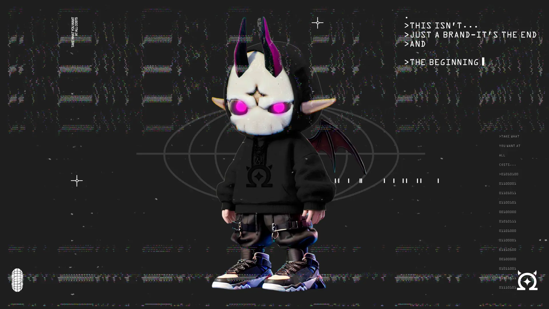
Omega is a demon-messiah of the digital age. Its image blends the archetypes of a protector, anarchist, and innovator — expressing ideas of strength, freedom, and defiance.
Created as part of the branding, the character is used in communication, merchandise, NFTs, and digital interfaces, reinforcing the brand’s tone of voice.
The mascot integrates seamlessly into Omega’s visual system through its modular style, graphic focus on the eyes, and branded hoodie identity.
It builds recognition and creates a deeper level of engagement within the digital branding ecosystem.

Communication that isn’t afraid of noise

Omega’s identity adapts effortlessly to unconventional visual formats. It doesn’t get lost in the noise — it amplifies it.
On posters, in dynamic videos, and across social media, the brand symbol remains recognizable even in digital distortion.
It’s part of the philosophy: to be present in chaos without dissolving into it.
Glitch, distortion, and digital grain aren’t flaws — they’re tools that express Omega’s style, mood, and stance as a cultural phenomenon.

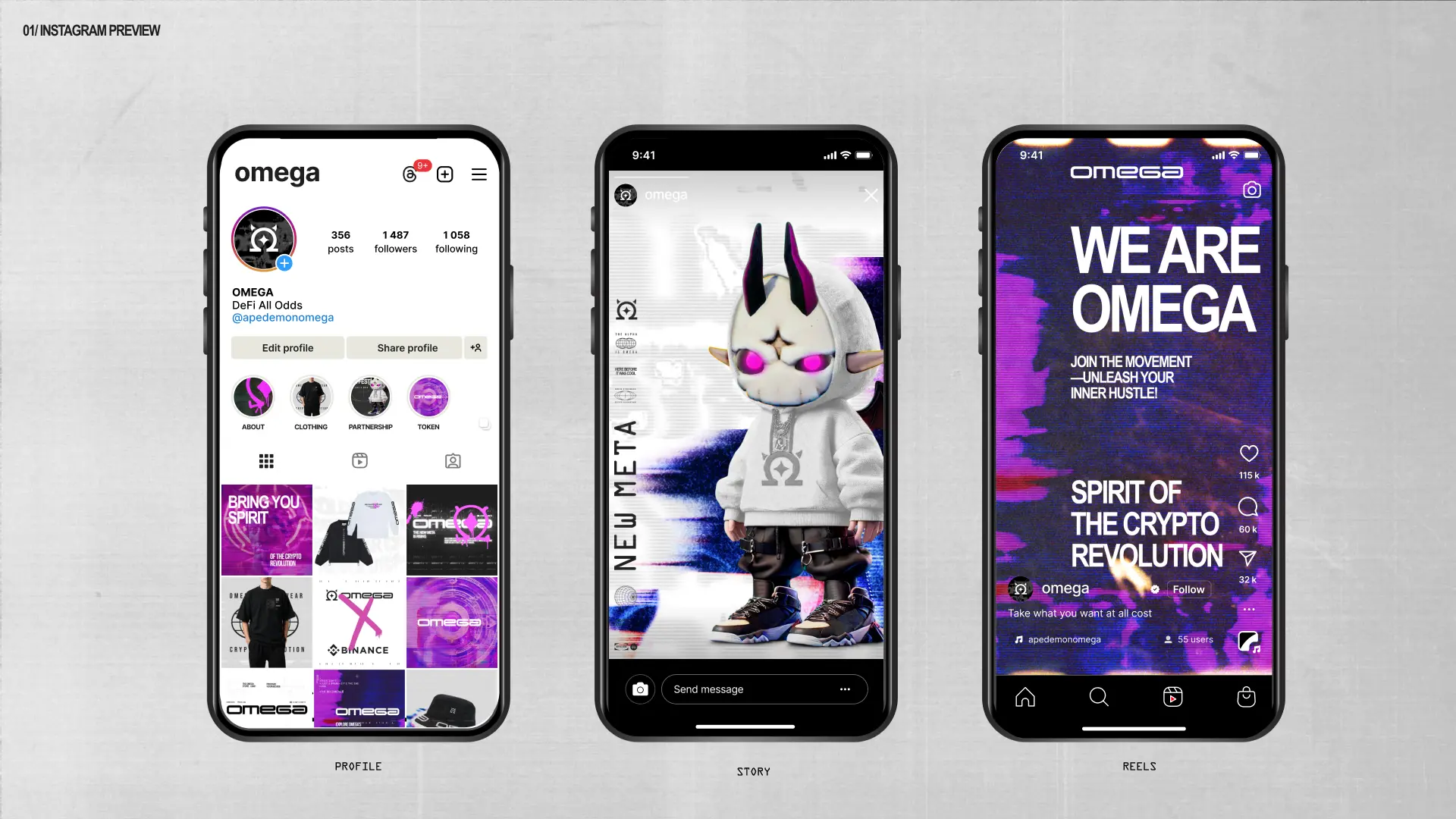
Social media as an extension of identity
Omega integrates confidently into the social media landscape — its identity adapts smoothly to formats like stories, reels, and profiles.
Graphic symbols, the mascot, and typefaces maintain their integrity even in fast-paced digital formats.
We built a visual system that stays recognizable through motion, scrolling, and storytelling.
Here, social media isn’t just a communication channel — it’s part of the brand ecosystem with its own structure, style, and emotion.
At Omega, we maintained a unified visual logic across platforms — Instagram and Facebook look like parts of the same digital space.
Regardless of format, brand elements remain recognizable:
The avatar, mascot, colors, and typography all work in harmony with each platform’s UX environment.
This allows the brand not just to be present on social media, but to express its ideology through structure and visual style.


The Omega Instagram feed is a full-fledged visual manifesto.
Every post is part of a unified graphic system that merges brand, movement, culture, and the aesthetic of a new generation.
Everything plays a role — from glitch graphics and grain to recurring symbols and the mascot.
We didn’t just design posts — we created a clear editorial system where each tile reinforces the identity, strengthens the brand, and delivers content worth saving.
It’s an example of how UX/UI design can live even within social media.


Merch Drop
Omega merch is more than clothing — it’s an extension of the brand’s core idea.
We transformed the visual identity into a physical product, where each piece carries a philosophy of breaking patterns, embracing freedom, and expressing individuality.
Graphic elements, typefaces, and slogans come to life on hoodies, t-shirts, caps, and even tags — creating a cohesive experience in both the physical and digital worlds.


In the collection, we focused on bold typography and clean silhouettes.
Phrases, logos, coordinates, and statements are applied with precision that reinforces the brand’s message.
The merch integrates easily into street culture, maintaining a balance between boldness and minimalism.


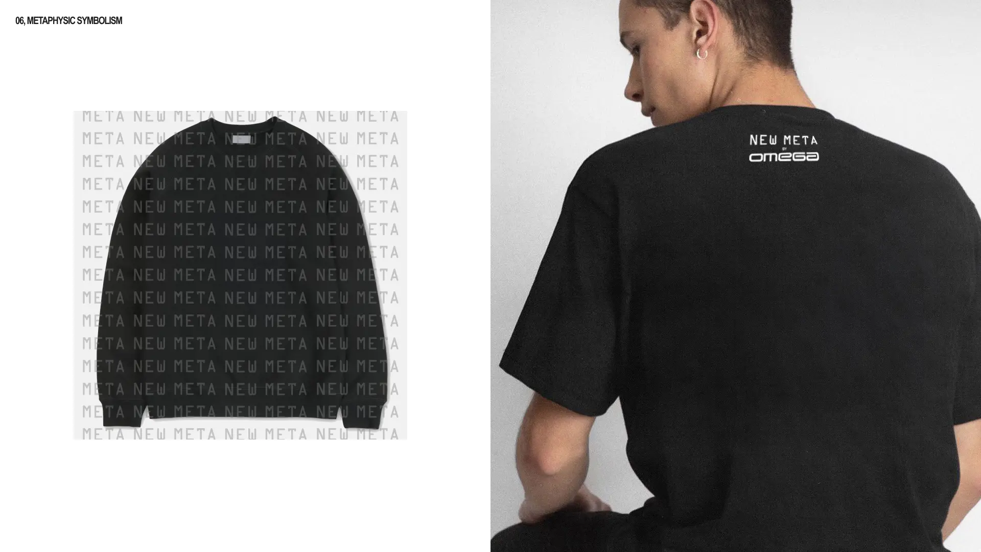
New Meta is the voice of a new generation.
A subbrand of Omega, it was created as a modular system that blends streetwear aesthetics with crypto culture and futuristic design.
Here, there are fewer rules and more experimentation:
glitches, blurred shapes, unexpected compositions, and visual cues for those who are “in the know.”
This isn’t just clothing — it’s an interface for expressing next-gen identity.


The New Meta collection combines graphic symbols, digital aesthetics, and elements of the metaverse.
Each piece is more than just design — it’s an encoded message: a challenge to norms, irony toward the system, and freedom of self-expression.
T-shirts, hoodies, and accessories are all created as part of the brand’s visual language, speaking to a new generation through form, texture, and attitude.