Papa Grella
The kind of client who knows exactly what they want: bold, stylish, and no fluff. All character, a hint of smoke, tons of flavor — and every detail crafted with love.

Papa Grella is a brand for those who appreciate the true pleasure of fire, grilling, and time spent in good company.
Our task was to develop an identity and digital branding that conveys warmth, strength, and a deep attention to detail.
Throughout the process, we explored several directions — from character-based concepts to more restrained visual solutions.
While working on the UX/UI aspect of visual communication, we tested various logo iterations, layouts, and stylistic approaches.
The final solution reflects the brand’s character best: clean geometry, a balanced color palette, and a confident form — fully adaptable for digital products and future use across e-commerce platforms.
The final mark of Papa Grella is a modern interpretation of strength, care, and freedom.
The geometric shapes of the logo scale effortlessly and work seamlessly across all formats — from packaging to digital media.
When working on the color palette, we focused on creating a balance between strength and warmth.
The primary colors — white and deep navy — highlight the brand’s clarity and confidence across both identity and digital environments.
Light blue and steel blue bring freshness and lightness to the visual language.
For emotional accents, we introduced deep green, yellow, and orange — creating a lively, dynamic mood that supports the brand’s online presence.
Altogether, the palette forms a flexible system that easily adapts to packaging, social media, and web design — and serves as the foundation for a broader design system for interface consistency.

Typography is an essential part of Papa Grella’s identity. It reflects the brand’s confidence, modernity, and openness.
We selected two fonts that work equally well in both printed materials and within a UX/UI design framework.
Montserrat is used for headings — clean, strong, and instantly recognizable.
Inter was chosen for body text — simple, readable, and comfortable for longer reading, especially within e-commerce interfaces.

The visual system of Papa Grella is built on simple geometric shapes derived from the logo’s construction.
We transformed these elements into flexible patterns and decorative motifs that complement the brand’s style and create dynamic visual solutions across various mediums — from packaging to digital platforms.


Social Media
Papa Grella’s visual identity was adapted for digital platforms with a focus on social media and mobile interfaces.
Profile layouts were designed to ensure the brand remains recognizable, consistent, and true to its character across any environment.

The design is built on core brand elements — geometry, the primary color palette, and a minimalist composition.
These visual solutions create the right first impression, set the tone for all communication, and function as part of a cohesive digital branding approach across social media.


Website
The Papa Grella homepage is the first point of contact with the brand, so we focused on visual comfort, a lively atmosphere, and easy access to products.
The interface conveys a sense of warmth, relaxation, and enjoyment of simple moments.
Large visual blocks, clean typography, responsive design, and clear structure create a smooth UX experience.
The site performs equally well on desktop and mobile — which is especially important in today’s digital and e-commerce environment.
Product Catalog
The product catalog was designed to make navigation as intuitive as possible.
A clear structure, smart filters, and a strong visual focus allow users to instantly understand what’s being offered — with no unnecessary steps or distractions.
A spacious grid, discount tags, “new” labels, and interactive elements come together to form a seamless e-commerce interface.
Each product card acts as a mini-showcase, combining the brand’s atmosphere with a thoughtful UX/UI design aimed at fast and confident decision-making.
Checkout Flow
We carefully designed every step of the user journey — from adding items to the cart to viewing order history. The cart interface is kept as simple and intuitive as possible, allowing users to easily adjust their selection without any friction. The checkout page is built around a clear user flow — only the essential fields, no distractions. The personal account follows a cohesive UX design, making it easy to manage orders and return to the platform with just a few clicks. This approach is rooted in product design principles, focused on user behavior and convenience at every stage of interaction.


Blog
We created the blog as a space for stories, valuable content, and deeper immersion into the Papa Grella atmosphere.
Each post is designed with a focus on readability and visual presentation — from text structure to high-quality imagery.
Individual article pages offer more than just reading — they let users explore the brand’s philosophy through details, traditions, and real stories.

Customer Reviews
We integrated the reviews page as a full-fledged section of the platform — combining real user stories, post-purchase emotions, and authentic feedback.
Each review is automatically pulled from the product page and includes a photo gallery, rating, quality tags, and easy navigation.
The system encourages users to share their experience — building trust in the brand from the very first interaction.

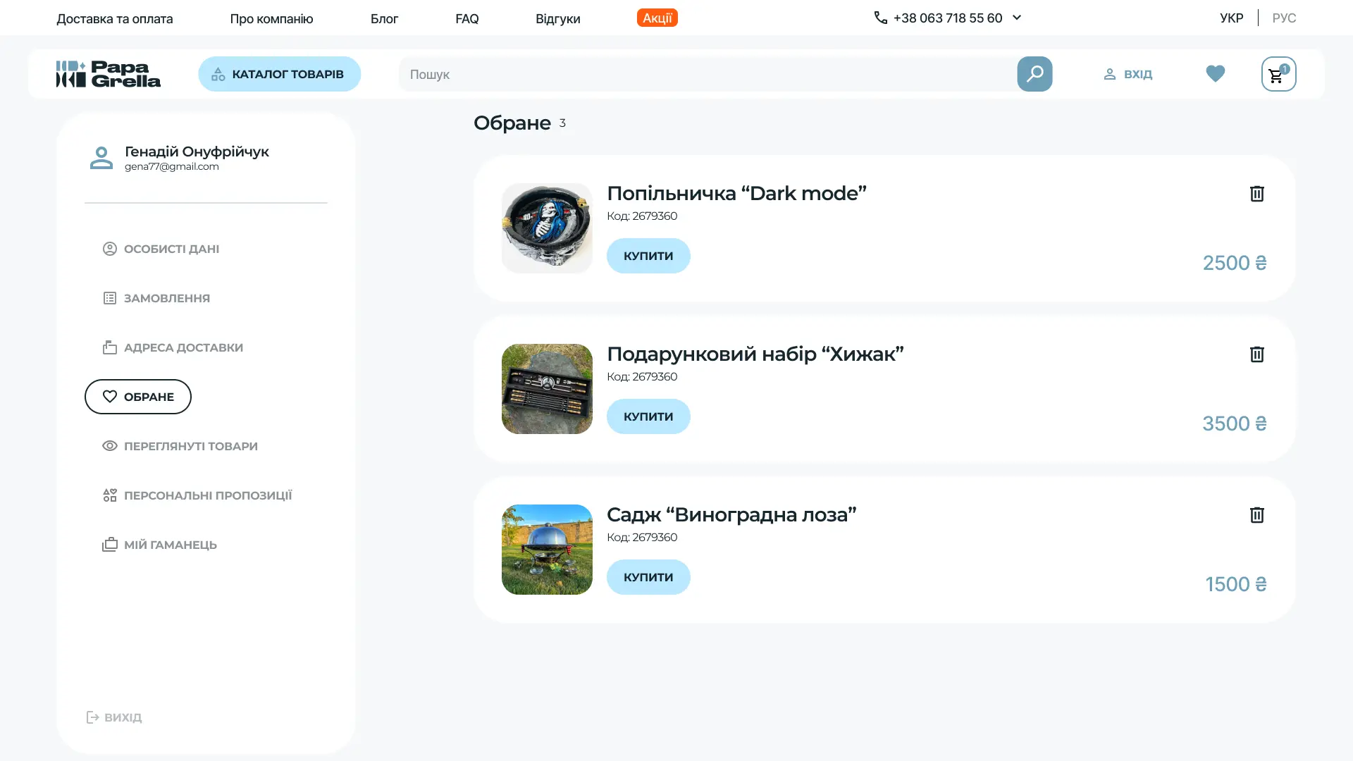
User Account
We designed the personal account to make it easy for users to manage their data, purchases, and preferences.
The menu is logically structured — from personal information to recently viewed items and personalized offers.
Navigation is straightforward, each section serves a clear purpose, and the interface remains smooth even on mobile devices.